Spatial correlation, variance and skewness
In data set 1 and 2, spatial correlation at lag 1 and spatial variance increase whereas spatial skewness decreases in data set 1 and increases in data set 2 toward the transition (fig. 1). These indicators are not estimated for data set 3 (for the periodic pattern).
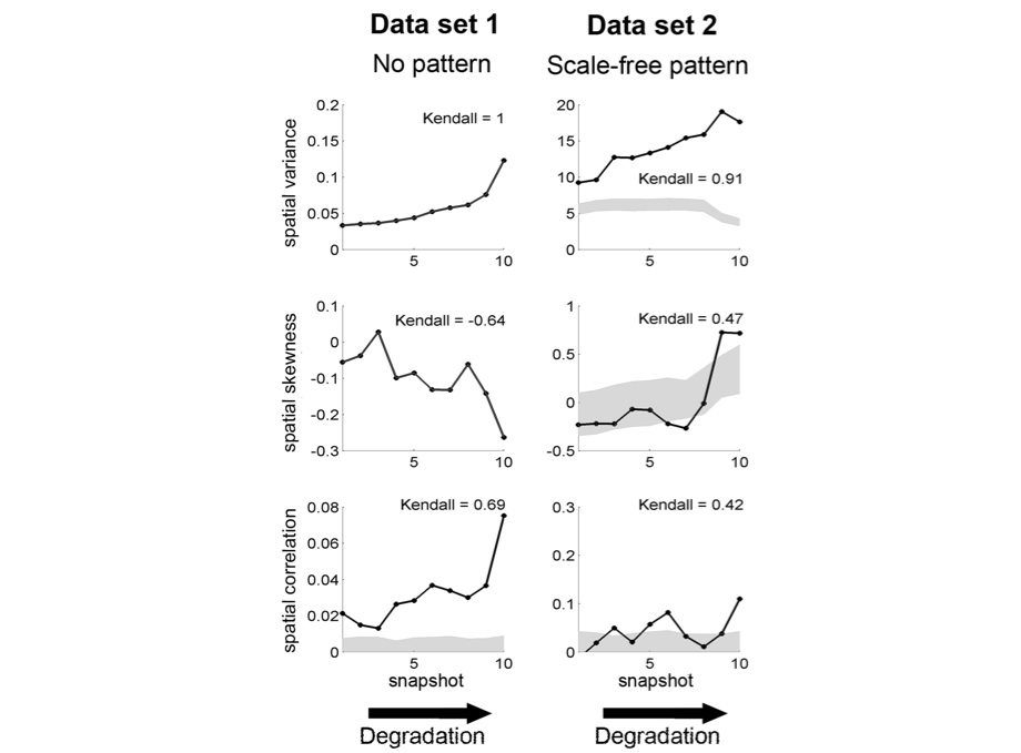
figure 1: snapshots of the system are ranked along the degradation gradient (x axis). This mimicks a scenario where we would not know the exact value of the driver but where we can order the data set along a degradation gradient. Left: local positive feedback model (data set 1). Right: local facilitation model (data set 2; original data transformed using 5×5 sub-matrices). First row: spatial variance. Second row: spatial skewness. Third row: spatial correlation at lag one. In each panel, Kendall’s , quantifying the trend of the indicator, is indicated. Gray areas correspond to 95% confidence intervals obtained using expected estimates from a null model (i.e. data sets of same size generated by reshuffling the original data set).
DFT
DFT analysis produces the spatial power spectrum characterized by reddening, i.e., the amplitude of the power spectra increases at low wave numbers (low frequencies), as the system approaches the transition (fig.2 first and second rows). The reddening of the power spectra provides advance warning of the transition in all data sets.
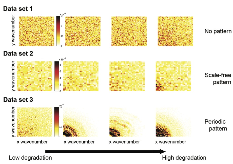
figure 2: the system approaches the transition from left to right column. Red color indicates higher values of the scaled power spectrum. The y and y-axis correspond to the wavenumbers along these directions. First row: local positive feedback model (data set 1). Middle row: local facilitation model (data set 2; original data transformed using 5×5 sub-matrices). Bottom row: scale-dependent feedback model (data set 3).
Non-periodic but patchy: patch-size distribution
Data set 2 was not only characterized by non-periodic patterns, but our visual examination reveals that it also exhibits distinct patches of two phases (vegetation and bare ground). In that case, it makes sense to look at the distribution of patch sizes. A way of plotting such data is to calculate the inverse cumulative distribution, i.e. plotting the number of patches whose size is larger than a given value as a function of
. The inverse cumulative distribution is nearly scale-free far from the transition, while its slope decreases and the distribution becomes bent (toward less large patches) as the system approaches the transition (fig. 3, top row). For comparison, we also plotted the inverse cumulative patch-size distribution of data set 3 that is patchy but periodic. Far from the transition, after the onset of pattern formation, the periodic patterns presented a patch-size distribution characterized by a sharp cutoff (fig.3, bottom row). Close to transition, the value of the cutoff decreases indicating decreasing patch size in the periodic pattern.
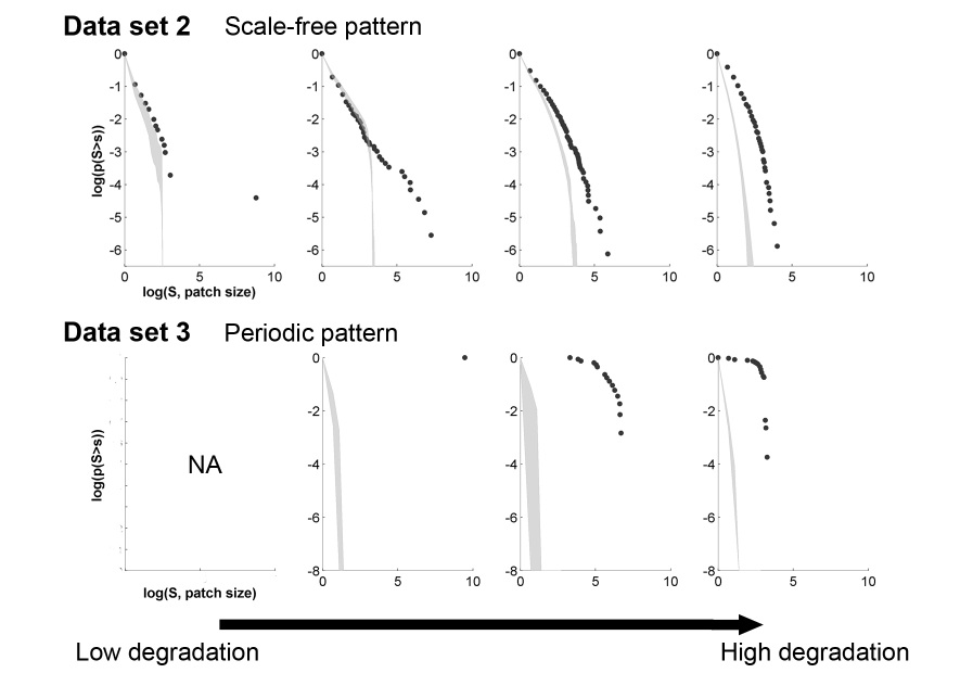
figure 3: The system approaches the transition from left to right column. First row: local facilitation model (original data not transformed). Bottom row: scale-dependent feedback model. Gray areas corresponds to 95% confidence interval obtained using estimates from a null model (i.e. data sets of same size generated by reshuffling the original matrix).